Is it just me or is the fact that the click-through link for someone's profile that you get when notified that someone has followed you on Mastodon leads to some useless page that doesn't show _any_ of their posts, requiring yet another hop off some link on the bottom of the page incredibly frustrating UX?
"Oh look, 50 new followers! 250+ clicks to see if i should follow them back or if they are just going for volume! (2 forward, 2 back, 1 to add) 50x."
Twitter: 1 to profile, 1 to add, 1 back
@kmett you mean the phenomenon when a certain remote user's profile doesn't seem to have any toots when seen from schelling, but does when you click through to their instance?
yeah that one is annoying! has to do with the distributed nature of the fediverse and the difficulty of indexing the entire network. its a known problem without obvious solutions! i've seen some proposals but none has wone out just yet
@pee_zombie I think I understand the 'why' of it all, but clicking to a local profile, then going down to the bottom to click on their remote profile, which opens in a new window, closing that window, then going backwards to add is just the sort of bad design-by-committee UX I was fearing coming over here to try this out.
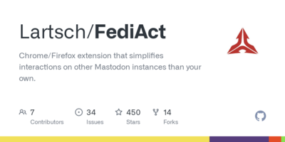
I wonder if I can't skip the local page and new window for the remote one with a scriptmonkey or chrome script of some sort, as that middle page is positively useless.
@kmett yeah its def not ideal, but there's always discourse and development happening, so mb someone will figure out a better way soon enough
also, if this helps, you can click on their avatar instead of scrolling down; not sure what you mean about "going backwards to add" tho

